top of page

work
Anchor 1
DonateKart
India's pioneering crowdfunding platform founded on principles of trust and transparency, seeks to bolster donor confidence in its platform.
My Role
UI Design Design System
Visual Design Design Strategy Design Research
Goal
The goal of the project is to revamp the DonateKart website, India's pioneering crowdfunding platform known for its commitment to trust and transparency. This redesign aims to enhance donors' confidence in the platform.
Duration
3 weeks
Collaborators
Designer: Shruti Jain
Mentor: Chitra Viswanathan
Tools
Figma
Photoshop
Illustrator
Overview
Background
What exactly is Donatekart?
Donatekart is an Indian platform for direct donation of essential goods to verified NGOs and charities. Donors can browse and purchase needed items posted by organizations. Purchased items are delivered directly to NGOs and charities, ensuring transparency and accountability.
Problem
What needs fixing?
The website suffers from disorganization, clutter, and usability issues, hindering donor engagement and trust. Moreover, it lacks mobile optimization, impacting the experience for over 85% of users accessing the site from mobile devices.
Impact
What values can I bring?
By enhancing the website's credibility and usability, Donatekart increases donation acquisition and user satisfaction, empowering more individuals to contribute meaningfully to societal causes.
Solution
Streamlined, user-friendly interface with transparency.


Problem Statement
How might we enhance Donatekart's website to optimize trust and credibility by addressing all the existing issues?
Challenge
What does the Existing Website look like?
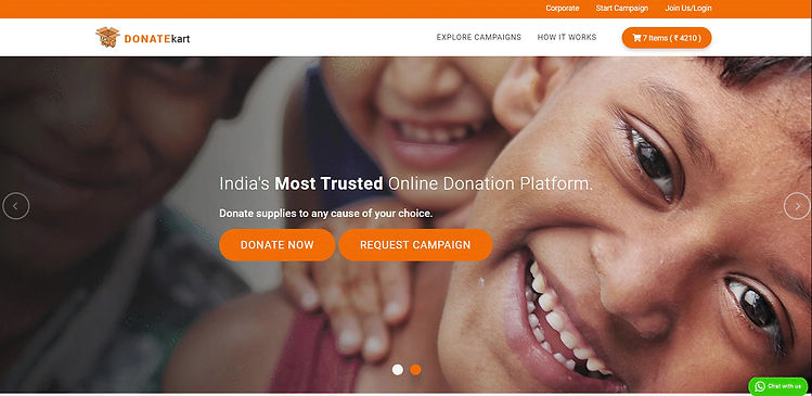
Desktop experience
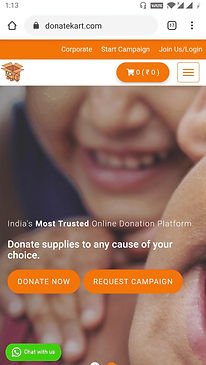
Mobile experience
Understanding the existing Donatekart system
Design systems and brand guidelines hold a near and dear place in my heart as a Visual Communication Design major and design systems advocate. Below are my personal observations on the existing Donatekart website that will help enhance the website's credibility and usability.
Cluttered Information
The website suffers from cluttered information. This makes it difficult for users to find what they need easily.
Inconsistent Use of Fonts
Using two to three different fonts occupying the same screen space adds to the visual clutter
Difficulty in Finding Donation Categories
Finding categories for donation isn't straightforward. Users may struggle to locate the specific causes they want to support.

Spacing Issues
Overall spacing, especially on the login page, presents a significant issue that causes readability and usability issues.
Placement of description
The description of Donatekart in the footer needs refinement. It may lead to confusion or misunderstanding about the organization's mission or purpose.
Lack of White Space
The website lacks adequate white space. This can make the pages feel overwhelming and hard to read.

Design Brief
Redesign the Donatekart website and its brand identity to enhance donor trust in the platform.
Rebuilding the Brand
Logo Ideation
The yellow circle within the cart of the Final logo represents the coin for donation, while the cart itself symbolizes the word 'Kart' from the company's name.
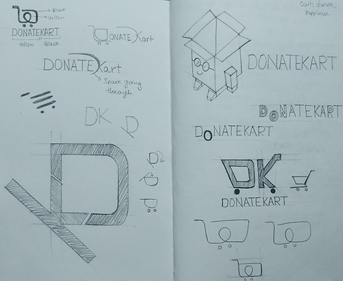
Logo Ideation


Final logo
Design System
We have curated an elaborate design system that harmonizes the Donatekart product experience, empowering the brand to uphold a consistent representation across diverse platforms.

Typography
#FFFFFF
#1C1100
#FCA311
#142240

Donatekart Icon


Icons
Action Button
Information Architecture
Information architecture involves organizing, structuring, and labeling content for better user navigation and understanding. The image shows the revamped website's information architecture, emphasizing intuitive pathways and logical hierarchies for a smoother user experience. It's part of a design system that maintains a consistent brand representation across platforms, empowering Donatekart.

Information Architecture
Information Architecture
1/1
Website Experience
We have crafted a web experience aimed at enriching user engagement with the Donatekart platform. This design not only ensures website responsiveness across various devices but also offers first-time users insights into the platform. It effectively highlights its value and functionality while guiding its operation. The design adeptly captures users' attention and sparks curiosity.
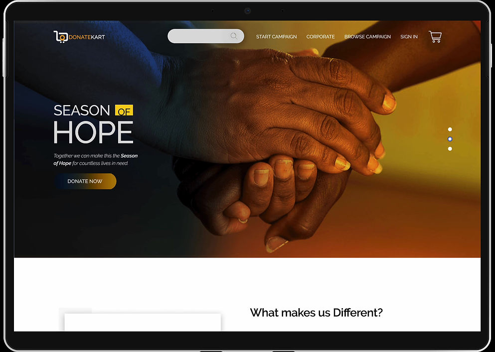
Desktop experience

Mobile experience
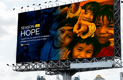
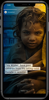
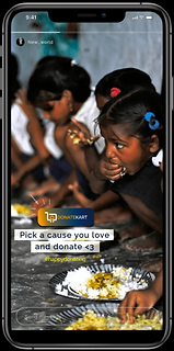
Experience outside the platform
Enhancing the platform's capabilities involves expanding its reach into diverse and engaging environments, encompassing both digital and non-digital realms. This entails leveraging Billboard advertisements, Instagram stories/ads, stickers, and filters.


Reflections and Takeaways
My biggest motivation...
Stems from my profound dedication to enhancing the Donatekart system, making it more user-friendly and trustworthy.enabling individuals to contribute to meaningful causes at any given moment.
My biggest achievement was...
Spearheading the development of Donatekart's new identity. Throughout this endeavor, I had the privilege of closely collaborating with individuals who share a genuine passion for philanthropy.
If I had more time...
I would have conducted usability testing and engaged in discussions with developers to assess the feasibility of implementing the redesigned website.
bottom of page